What is a landing page? Inexperienced users often get confused since the word combination is quite unusual. Although “landing” often equals “grounding,” its meaning from the marketing standpoint is not the same. In the business world, a landing page means a one-page site encouraging users to take whichever action a marketer needs, like buying, subscribing, downloading, etc. A properly designed landing page is a guide to success.
It’s not a secret that users sometimes take landing pages for business card sites. The main difference between landing pages and business card websites is that the landing page is a one-page site that promotes a specific product. Contrary to this, the business card website presents the company and can be dedicated to many products. Landing pages aim to market the product and call visitors to take action.
Now, words aside. Let me explain what the landing page is, its benefits, why you need it, and how to create a landing page.
- What Is a Landing Page?
- Unveiling the Main Secrets of Landing Page Designs
- Landing Page Types
- Landing Page vs. Home Page: Main Differences
- Must-have Elementor Landing Page Elements
- 5 Best Pre-Designed Elementor Landing Page Templates
- How to Create a Landing Page Using Elementor & Crocoblock
- Conclusions
What Is a Landing Page?
When reviewing the best landing page practices and examples, I assume that the landing page is, first of all, a targeting tool. So, answering the question “What are landing pages?” I’d like to say that landing pages are a part of the advertising campaign and a link between the advertisement and the product to be sold.
Landing pages contain information about why users need this product; they help convert visitors to clients. Mainly, it refers to users who did not react to banners. The processing chain is as follows: advertising 一 landing page 一 buying. It is like taking the visitor by hand to go together through the thorns to the stars, i.e., through the sales funnel to conversion.
One should develop a landing page design individually, making every element of the page layout contribute to conversions. Here, a website builder offering more plugins (including SEO and widgets) will win.
In my humble opinion, Elementor is one of the best web design tools because it combines both landing page templates and the possibility to develop a custom design with the necessary structure. People land there through ads by clicking on links in emails, social networks, and other sites.
I recommend Elementor as a WordPress website builder since the Elementor landing page traditionally includes all hooks to grab the attention: widgets, videos, images, texts, etc.
The content of landing pages comprises information, visuals, benefits, a call to action (CTA), buttons like “Share,” and social icons. Elementor makes it possible to create page layouts for their custom positioning. But the product first 一 no design features can outshine the product’s benefits.
Unveiling the Main Secrets of Landing Page Designs
Googling the design landing page query shows a lot of advertising but not structured information. So, I’d like to fill this gap:
- there are the following formulas for creating a landing page: AIDA (attention, interest, desire, action) and PMPHS (pain, more pain, hope, solution);
- when building a landing page, focus on your marketing strategy;
- aptitude and marketing 一 weak content and widgets are the tombstones of any strategy, especially if developers do not consider the target audience;
- landing pages have only some seconds to catch attention;
- it’s best for landing pages to have a CTA on a button, so make them bright and visible.
Landing Page Types
There are different types of landing pages that refer to the target action. They are to sell, subscribe, inform, or combine some purposes. In particular, there are the following types of landing pages:
- splash landing pages (and even splash home pages) look like shiny diamonds by video, animation, and visual effects because they advertise the product;
- squeeze landing pages collect emails and other information from site visitors in return for a special offer;
- lead capture landing pages aim at sustainable relationships with your leads to turn them into loyal customers;
- click-through landing pages are optimized pages to path visitors through all stages of the marketing funnel to the product page;
- “unsubscribe” landing page is a means of improving the product, despite the unpleasant name;
- long-form sales landing pages envisage a detailed description of the product, an explanation of its benefits, and work with price objections. They are full of in-depth reports and other comparisons, but despite the boring name, they make possible usage of all SEO tools;
- thank you landing pages aim to help you express gratitude to your clients;
- coming soon landing pages are hooks to catch attention;
- 404 landing pages mean not a dead-end but space for creativity and redirection to the correct page.
Landing Page vs. Home Page: Main Differences
As mentioned above, the landing page is dedicated to a specific product, contrary to the website containing a lot of structured information. This fundamental difference means low chances to overtake full-fledged sites in organic search results. Therefore, targeting and visuals are two cornerstones to stick to when building a landing page the right way.
Landing pages mean one place, time, action. They are the best when you:
- launch a new business, a product, and advertising campaign;
- promote an event or webinar;
- replace your home page on social media platforms;
- need lead generation.
Consequently, landing pages should be more impressive than home pages. One way to achieve that is to add more visuals.
Must-have Elementor Landing Page Elements
Different goals mean different tools and different elements on a landing page. Anyway, the common elements include:
- text blocks like title and supporting subtitle;
- visual effects to make text blocks more grounded;
- buttons for CTA.
Additionally, you can add widgets, quizzes, infographics, user-generated content as social proof, etc., to the Elementor landing page. In modern web design, widgets are must-have elements. They are like spices to the main course because they make the site memorable and exciting. Although a significant number of widgets differ in functionality, appearance, place of embedding, they serve the same purpose 一 to increase sales.
At the dawn of web design, embedding widgets was complicated because it required significant changes to the HTML code. It is no longer the matter; it’s a piece of cake these days! To make ground to my words, take a look at these 150+ must-have Elementor widgets and plugins to embed them.
What can the widgets be used for?
Some words aside. Dividing into must-have or not is very conditional. When building landing pages, it would be best to strike a balance because too many widgets are annoying. But the good news is that the JetElements plugin grants access to 42 easy-to-use Elementor widgets.
There are indeed a lot of plugin developers for Elementor who propose something like this. But JetElements offers such a broad scope of widgets in one plugin. It’s a magic key to a box of miracles, and you can use each of them to make your site memorable.
Widgets are subcategorized according to their functions:
- widgets to make images more memorable: Advanced Carousel, Slider, Images Layout, Portfolio, Image Comparison, Instagram, Banner, and Inline SVG;
- widgets to make a site more impressive: Animated Box, Scroll Navigation, Animated Text, Headline, Dropbar, and Countdown Timer;
- widgets to make texts more dynamic: Posts;
- widgets to make a business more visible on the web: Services, Price List, Pricing Table, Testimonials, Team Member, Logo Showcase;
- widgets to make data clear: Table, Pie Chart, Progress Bar, Circle Progress, Vertical Timeline, and Horizontal Timeline;
- widgets to make buttons more effective: Button and Download Button;
- widgets for WooCommerce integration into Elementor.
The enlisted widgets boast the following benefits letting you:
- customize texts, images, videos, and buttons to make them more impressive;
- provide marketing data and make the landing page more SEO-friendly;
- structure the information for better usability;
- make your site more user-friendly.
The JetElements widgets are so comprehensive and diverse that everyone will find something valuable. This plugin is like a treasure chest.
What are the principal elements?
According to the 2021 web design trends, a website should be more visible and user-friendly. And the widgets can make that happen. Take the Interactive Animated Box widget, for instance. It gives the opportunity to touch the product, scratch its label, peel off the cover as in life, and many more:
Below, you will find other interactive elements every website would benefit from:
- countdown timers;
- headings and subheadings;
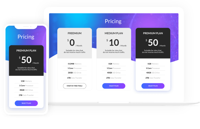
- pricing tables;
- testimonials;

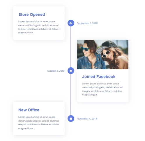
- vertical timelines;
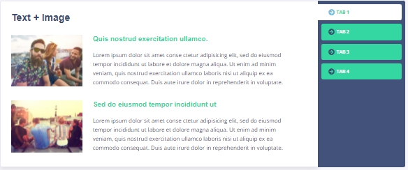
- tabs;
Did you notice I use the words related to magic 一 the wizard, the magic wand, miracles? They are reasonable because the JetElements plugin for Elementor is a password to the web design magic world.
More details are in this complete widgets overview.
5 Best Pre-Designed Elementor Landing Page Templates
One can say that it is too dull to pick widgets for one page. I collected five best pre-designed Elementor landing page templates to oppose this idea. They include widgets. Crocoblock team aims to be at the cutting edge of the web design trends to propose them to you.
Arnau

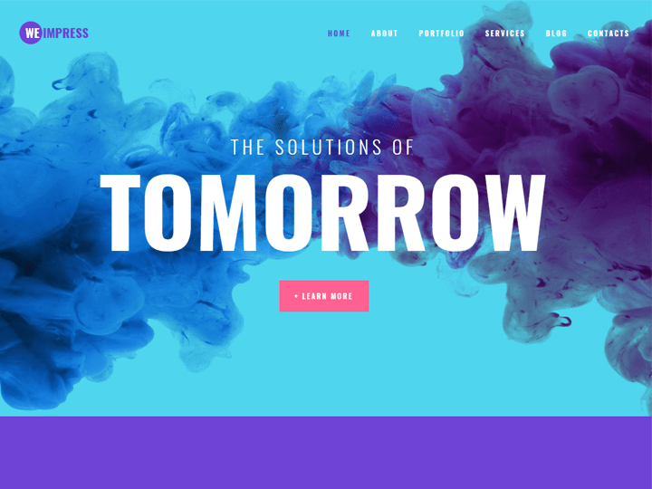
WeImpress
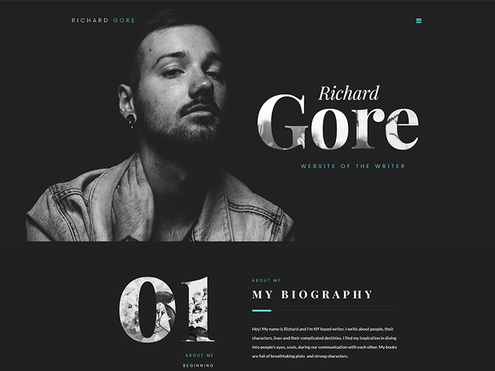
Richard Gore
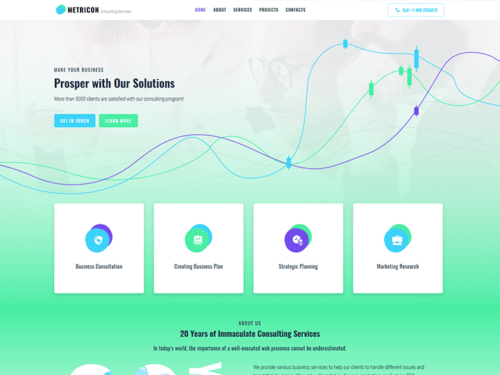
Metricon
Standocs
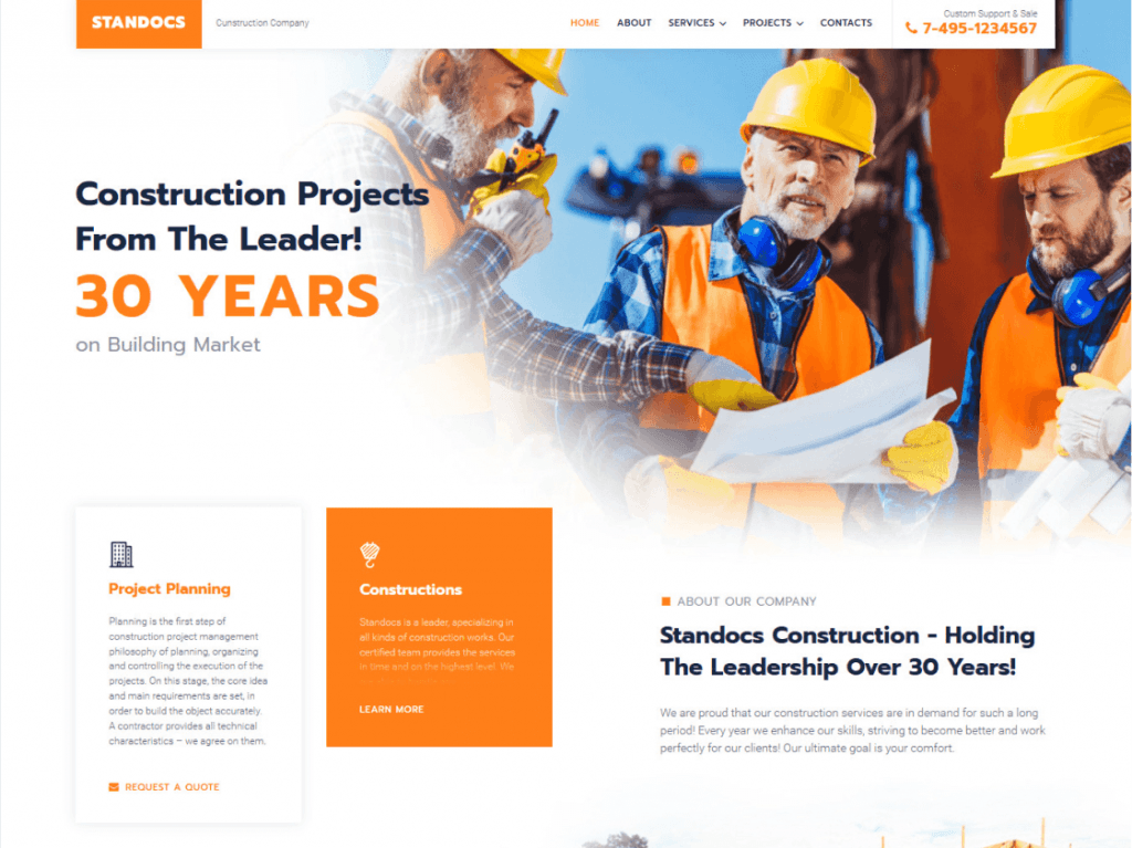
Templates for the Elementor landing page are all-inclusive. They contain everything that makes the landing pages trendy and practical: hero-blocks with visual text prevailing, layering of elements (including processed cutouts) with partial overlap and asymmetrical layouts, volume illusion by making a background to photos, user-generated content as social proof, staggered grids, and scroll animation.
It’s my choice, and it reflects my preference. But the scope of landing page templates is broader. Just look at the full range of the Crocoblock design templates.
How to Create a Landing Page Using Elementor & Crocoblock?
The main problem any probator faces is how to start. The most often Google queries in this field are how to create a landing page, make a page your homepage, or make a landing page. I hope this step-by-step explanation will be helpful.
In a few words, add a new landing page and choose the template from the Magic Button library.
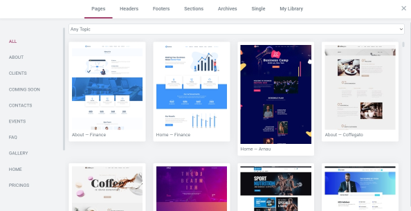
Once you have decided which template to use, click on the “Insert” button.

The left-side widgets are the drag and drop ones. So, take the best widgets and drag them to the necessary place. Finally, customize and publish the landing page.
Conclusions
You see, the main principles of effective landing pages are as follows:
- clear goal and content;
- understandable navigation;
- adaptive design;
- widgets that make your site more impressive.
Visual design and widgets are the main factors. Although there are no all-purpose landing page templates, a well-done landing page should not be over-designed but be understandable.
The first screen should be clear and all about the product. In general, many screens and a long scroll are the problems of landing pages, so they should capture attention immediately.
Aptitude widgets mean a lot for the Elementor landing page. They are CTA buttons, contact forms, a timer, custom fonts, review sliders, pop-ups, YouTube videos, maps. But the misdesign and mistargeting lead to decreased conversions and the number of clients. Because, as C. D. Jackson said, great ideas need landing gear as well as wings. Here it’s all about you, and JetElements gives you the freedom to customize all widgets.
