Have you ever wondered what JetPlugins can help you build? Would it be possible to create a fully-fledged blog? Connect the post types, make a layout and showcase those posts beautifully? 🤔
Yes! Crocoblock products will have you covered. Using the right plugin combination, one can build a blog website of any complexity. In fact, why don’t we check out some live examples made with Crocoblock? You’ll see what is possible and maybe get inspired. 😉
Top 7 WordPress Blog Websites
What unites all the gorgeous websites below? It’s Crocoblock. These web spots are powered by different JetPlugins, mixed, and matched flawlessly to achieve a signature design and implement the needed functionality.
Wysmakowane
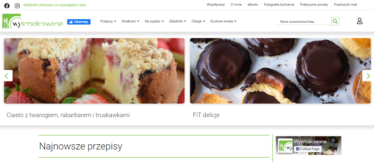
What do you think a WordPress food blog website should look like? Is it a recipe-full cookbook, bright colors, and drool-worthy pictures? Wysmakowane would be a great example. It’s a warm online spot run by Kasia, a passionate cook from Poland whose recipes help to cultivate good eating habits. The website has recipes for every occasion – from simple breakfast ideas, soups, and main courses to pastry, desserts, and holiday dishes.
Once you land on the homepage, you’ll see a website header, storing every component for comfy site navigation: a horizontal multi-level menu, a quick search box, a navigation menu, a text ticker announcing the latest recipes, social media icons, and a link to the account/login page. Below the header, there’s a slider gallery showcasing the most popular recipes.
As to the website design, one would say it’s modest. Pages are neat and well-structured; the homepage, catalog pages, and search results archive contain Listing Grids, where all recipe details are showcased through dynamic widgets. Multi-page archives are paginated. A single recipe page has a sticky column section, which shows important recipe details, and some promo banners on the side.
Dynamic logic includes a tagging system, making it possible to run through all recipes and output those under a certain tag on a separate page. When you need to see all banana recipes, for instance, you would press the needed tag in the footer. The same option is available in the site menu: Składniki > Owoce > Banan. It’s super handy, right?
I did spot one downside, though. All website pages look content-heavy, and the footer is overly detailed – these things could be optimized to ensure a better UX.
Developer, Theme & Template: Thomas Anderson
Plugins: JetElements, JetWooBuilder, JetSmartFilters, JetBlog, JetMenu, JetPopup, JetEngine, JetThemeCore
SPOKFACE

SPOKFACE started as a response to the worldwide COVID-19 pandemic when many people found themselves isolated and discouraged. The team wanted to compile “a safe space to watch and share interesting content,” so they created a blog website. It features category-specific videos that help people improve themselves and their relationships, get a better work-life balance, become productive and mindful, cultivate healthy habits, and achieve personal happiness.
I personally deem the website design rather simple. There are several Listing Grids on the homepage. The hero section contains clickable category cards, which help to sort the videos immediately. There is Load More functionality, the Subscribe to Newsletter section, laconic header and footer templates, and the AJAX search box. To navigate the website at ease, SPOKFACE developed a hamburger menu.
Moving to other pages, I couldn’t help but notice a mouse-move parallax effect on the About Us page. A single page boasts a YouTube video section followed by article tags pulled through dynamic JetEngine widgets. Scrolling down, you will see social media links to share the video. As to the Related Videos section, it’s another Listing Grid sporting category and sub-category badges.
To wrap it up, two words come into mind: “basic” and “neat.” SPOKFACE is a blog website that is easy to navigate and where nothing distracts visitors from the actual content.
Developer: Logobby
Theme & Template: Sam Abramoff
Plugins: JetElements, JetMenu, JetTabs, JetBlocks
Magdalena Korol

MagdalenaKorol.com is a WordPress personal blog website started and run by a Polish lawyer. Pani Magdalena is passionate about life, fashion, traveling, and legal marketing. For over ten years, she’s been helping marketing agencies, startups, and enterprises in the fashion & design industry to protect their brand and personal rights, prepare trade agreements, and handle unfair competition.
As to the website design, it is laconic yet vibrant due to many color accents – featured images and a slider in the hero section. On the homepage, you’ll spot another visual effect called section parallax. There are More Articles and Quotes sections where posts are displayed in a carousel. To reach out to Magdalena, a site visitor would have to fill out a Contact form on the corresponding page.
Altogether, the blog seems warm and friendly. It feels intimate when the author writes about concerns and emotions. On the other hand, it sounds professional when covering law topics. JetElements has come in handy to create that unique and stylish feeling about the website.
Developer, Theme & Template: Norbert Niedojadlo
Plugins: JetElements
Groedgrisen
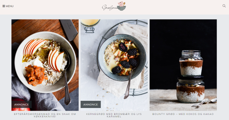
Another culinary blog on the table is Groedgrisen. Anna from Denmark started it as a hobby and saw it turn into a popular WordPress food blog website. The blog houses many recipes – from simple oatmeal to fancy cinnamon bread. Anna is passionate about breakfast, and you will find many ideas for a simple yet nutritious breakfast. What I like most is that all recipes are simple to follow. Now let’s focus on the website, shall we?
The Danes cherish “hygge,” which can be roughly translated as “coziness,” but is a broader term. It’s a lifestyle aimed at creating a cozy atmosphere, enjoying life and its gifts surrounded by good people. When looking at Groedgrisen, it’s all about hygge. Aesthetic photos, vintage silverware, well-thought composition, and accent details – it’s pure art. To follow the pattern, a site developer accommodated blog posts into neat Images Layouts and Listing Grids where new/sponsored posts have badges.
Other functional elements include a navigation menu and a hamburger menu fit into a pop-up. There’s a search box in the pop-up and on the homepage header. Besides, one can run a search and apply AJAX filters from the Recipes archive page. The latter incorporates Checkbox filters, a dynamic results counter, and a Pagination widget.
Dynamically, Anna’s blog is powered by JetEngine. It helped to create custom post types and CPT layouts and covered the dynamic logic. As a result, she’s got a smart-looking, well-organized website, which deserves at least a glance.
Developer: BloggerSpace
Theme & Template: Frederik Beier
Plugins: JetElements, JetSmartFilters, JetPopup, JetSearch, JetEngine
ILAUD
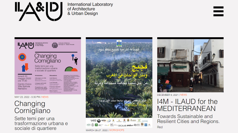
ILAUD is a portal dedicated to projects run by the International Laboratory of Architecture & Urban Design. Their core focus is “the problems of human habitat and environment,” and they carry on their activities through laboratories. The ILAUD team gives lectures and seminars and engages people in online and on-site studio work. They conduct extensive research to determine how to reuse the architectural and urban heritage, requalify the contemporary town, design the physical environment, and more.
The website is quite modest-looking; it is basically a Listing Grid featuring recent news about the projects. All the data is pulled from the CPT meta fields to the front end through Dynamic Widgets. In addition to the standard grid layout, we can spot masonry on the home and Research & Projects pages.
ILAUD is the best to illustrate what you can achieve using just one Crocoblock plugin, JetEngine. It handled custom post types and their dynamic output and helped to structure the website pages.
Developer, Theme & Template: Mediatria France SARL
Plugins: JetEngine
Web Times
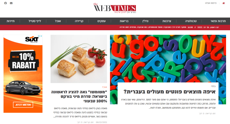
The Web Times site is basically a digital magazine – it has many headings, colorful cover images, always fresh articles, and nice categorization. The blog covers topics related to business, lifestyle, food, health, real estate, technology, tourism, education and culture, shopping, and careers.
The developers kept it simple and intuitive, so the homepage architecture is pretty much ordinary. It comprises a header, where one will find a text ticker announcing the latest headlines and a navigation menu allowing one to view all category-specific articles at once. In the footer, there is quick newsletter signup. The page body contains Listing Grids showcasing the newest additions to every blog category.
The content on the website is arranged left to right, according to the site language requirements (Hebrew). Thanks to JetBlog widgets, the development team managed to create a blog article structure. JetEngine’s dynamic features made it possible to add new content and output blog posts on the front end.
Developer: Sara Kariv
Theme & Template: Shaked ADV
Plugins: JetBlog, JetEngine
Build A Cast
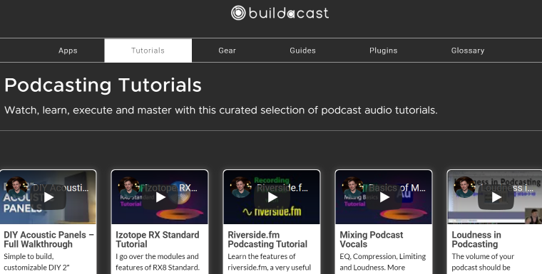
Last but not least, we’ve got Build A Cast, a WordPress blog website dedicated to all things podcasting. There are podcasting tutorials, guides, gear overview, related apps and resources, and plugins one may need when building a podcast from scratch. Those who never set foot on the podcasting path might find a Glossary section pretty useful.
Build A Cast’s color scheme is mostly neutral: white/black text and a light/dark background. Everything is legible, as the colors coordinate quite naturally. Regarding design decisions, the first and foremost is to arrange site content into listing grids. Podcast tutorial descriptions, plugin prices, etc., are dynamically fetched to the front end. There is a possibility to add tutorials to the wishlist, implemented thanks to JetEngine’s Data Stores.
To build website page templates, the developers used JetThemeCore. It allows you to create a header, a footer, and even the whole page despite its type. Additional functionality includes AJAX search from the homepage, a tagging system allowing website visitors/users to sort all content by a tag, breadcrumbs, and login/logout functionality.
Last but not least, we can spot several JetTabs (Classic Accordion widget applied to certain website sections like Comments and Reviews) and JetElements (buttons, clickable links, etc.) applications.
Developer: CrossCaster
Theme & Template: Buddy Bliss
Plugins: JetElements, JetTabs, JetEngine, JetThemeCore
Bottom Line
As you can see, it’s possible to finalize a development project using nothing but Crocoblock plugins. Today, we’ve checked out seven WordPress blog websites that support the statement.
- Wysmakowane is a food blog where you can jump from one recipe to another due to exceptional dynamic connections.
- SPOKFACE gives life advice to those who need reassurance through clickable front-end category cards.
- Magdalena Korol is a lawyer’s personal blog, which got its unique looks thanks to the section parallax effect.
- Groedgrisen is a “hyggelig” food blog where you can use a smart filtering tool to find the needed breakfast recipe.
- ILAUD serves a great cause and is powered by JetEngine to avoid muss and fuss and bring their projects into the spotlight.
- Web Times is a blog featuring everything from health and food to technology and real estate.
- Build A Cast is a mecca for podcast lovers, teaching them to build one from scratch.
Sometimes, the most prominent projects get awards – Site of the Week, Site of the Month, Site of the Year. Do you have a project worth nominating? We’d love to see it. 🤗
