Pop-ups are widely utilized across various websites for diverse purposes. However, if used incorrectly or excessively, they can harm the browsing experience and even increase bounce rates.
This article explains what website pop-ups are, why website owners employ pop-ups even if they are not what users want to see, what sets them apart from other web design elements, and how to balance their effectiveness in capturing user attention and respecting their browsing experience.
I’ll be making illustrations for different types of pop-ups using Crocoblock’s JetPopup plugin, as it provides flawless integration with the Gutenberg editor, includes multiple templates, and requires no previous training.
Table of Contents
- What Is a Pop-Up?
- What Are the Functions of Pop-Ups?
- Benefits of Using Pop-Ups
- Cons of Pop-Ups
- How to Create User-Friendly Pop-Ups
- Conclusions
What Is a Pop-Up?
Web pop-ups are graphical elements of the user interface that appear on top of the current page and are often triggered automatically without the user’s intent. They can be different sizes and shapes and appear in different screen parts. Regardless of their appearance, all pop-ups differ from web pages because they can’t be accessed directly but only by the parent page. At the same time, they have no linkage with the parent page, so there is no “Previous Page” button in pop-ups.
Effective pop-ups are designed to grab users’ attention and make a strong statement. Sometimes website visitors must take certain actions in the pop-up window, such as acknowledging their age or agreeing to the website’s policies, before proceeding to further browsing.
Types of pop-ups by form
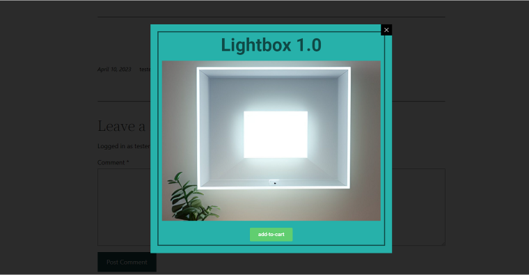
Fullscreen pop-ups have the most chance of catching the viewers’ attention. They cover the entire browser screen and typically appear immediately after the visitors land on your page, preventing them from getting distracted by other content. This type can be used in aggressive pop-up marketing, but it’s also the one that can be very irritating if used wrongly. Lightbox pop-ups are smaller than fullscreen, appearing on top of the web page, dimming the background and bringing focus to the pop-up content. This pop-up box is often used to display videos and images where the original space on the webpage is too small.
Slide-in pop-ups appear at the edge of the screen. Because these elements don’t cover any meaningful content, they are less intrusive than lightbox or fullscreen pop-ups and don’t interrupt the user experience on the website. This type of pop-up is becoming increasingly popular as a way to integrate chatbot assistants on websites.
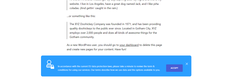
Another common type of pop-up is a banner or bar pop-up which appears as a narrow bar at the top or bottom of a web page, fitting the website design perfectly. It visually resembles static website elements, but like other pop-ups, it can be programmed to emerge where and when you want. It is a perfect solution for announcing site-wide news and the most popular pop-up for cookie policy.
Types of pop-ups by triggers
The power of pop-ups comes from the ability to control when they appear on a website. Combining different pop-up forms and triggers can create precise tools for performing various functions according to user behavior.
Here are the most popular types of pop-ups by triggers:
- Timed pop-ups. These pop-ups will appear after a specific amount of time that the user has spent on a web page. If configured correctly, they will only be shown to users interested in the page content.
- Inactivity pop-ups. These pop-ups will appear if the user stops interacting with the website for a certain period, but the browser window is still open.
- Scroll pop-ups. Like the timed pop-ups, these pop-ups target users who have shown interest in your content. They appear when the user has scrolled down a certain percentage of the page.
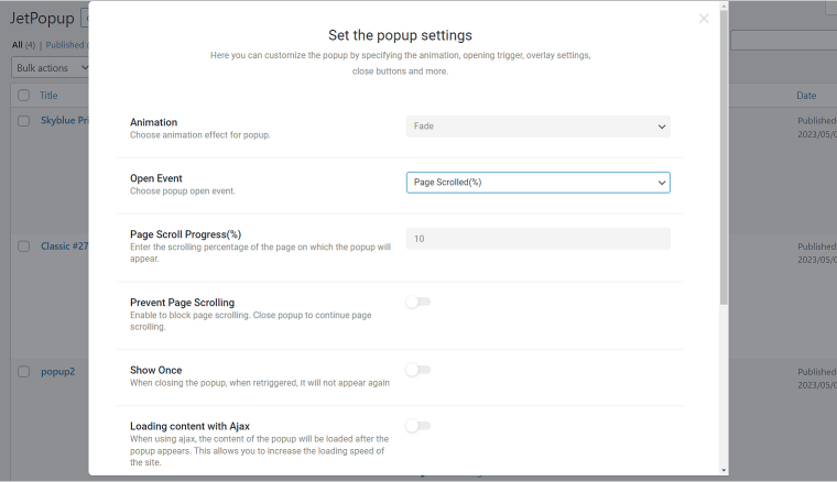
- Exit-intent pop-ups. These pop-ups attempt to recover abandoning customers, for example, by offering a special offer, when they detect cursor movement towards a closing sign.
- Entry pop-ups. These pop-ups are triggered by opening the web page and load shortly after or even before the page content. Their benefit is that the user is not yet distracted by other content, but their effectiveness largely depends on their message.
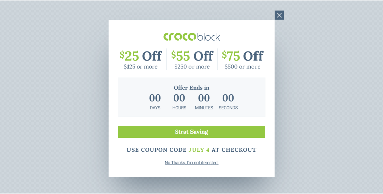
- Time-scheduled pop-ups. You can select the date and time for pop-ups to appear and disappear from the website and use them for product launches or seasonal sales. To increase the effectiveness of time-limited pop-ups, include a countdown timer.
- Click-triggered pop-ups. These pop-ups are activated when users click linked buttons, images, or other preset web page elements. They are the least annoying and can substitute landing pages.
- Hover-triggered pop-ups. Similarly to click-triggered pop-ups, they are less intrusive than the other pop-ups but may not be effective on touch-screen devices.
These different triggering options allow website owners to display pop-ups at the right time and context and improve user engagement and conversion rates.
What Are the Functions of Pop-Ups?
As you begin to explore all the pop-up varieties, their diverse features and capabilities, you realize that their functionalities are countless. The purpose for their use depends on the website, business service, and the intention of website owners. The possibilities of what they can accomplish are only limited by the web designers’ imagination and the tools they use for creating pop-ups. To fully utilize pop-ups, it’s important to use versatile solutions with many customization options like JetPopup.
The pop-ups can be broadly categorized into three categories based on their functions: privacy-related pop-ups, marketing-related pop-ups, and redirections to different parts of the website. Let’s explore each type along with a few pop-up window examples.
Privacy-related pop-ups
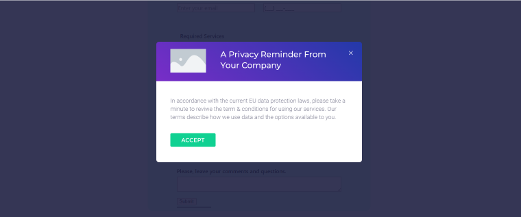
These pop-ups focus on obtaining user consent, providing information about data collection, and notifying about updates to the site policies. Some examples include:
- cookie consent pop-ups to inform users about the website’s use of cookies and allow them to accept or decline cookie usage;
- GDPR compliance pop-ups to notify visitors about data collection and provide options for managing their consent under the General Data Protection Regulation (GDPR);
- age verification pop-ups that require users to confirm their age before accessing age-restricting content or making age-restricting decisions.
Marketing pop-ups
Marketing, or sales-related pop-ups, are the widest category of pop-ups aiming to engage site visitors, promote products or services, and capture leads. Here are a few website pop-up examples:
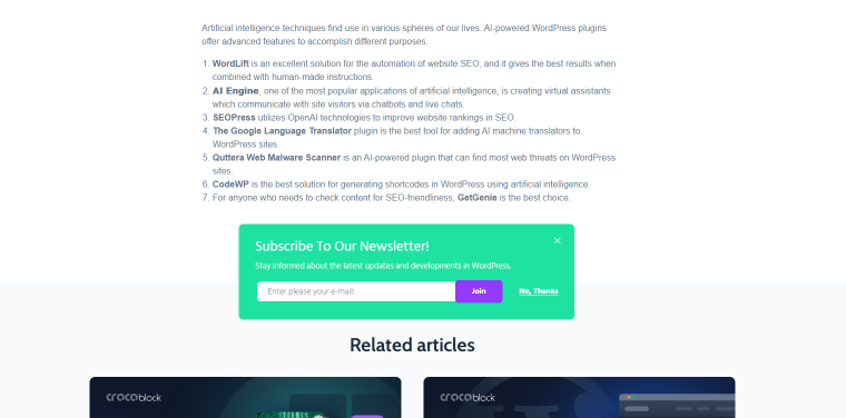
- newsletter subscription pop-ups offering subscribers exclusive content, updates, or special offers;
- exit intent pop-ups appear when the users are about to leave the website, encouraging them to stay and make a purchase;
- abandoned cart pop-ups reminding the users about the items left in the cart and encouraging them to complete the purchase;
- discount or sale pop-ups offering time-limited sales or promotions, sometimes combined with countdown timers to create a sense of urgency;
- social media follow pop-ups prompting visitors to follow the brand’s social media accounts for updates or special offers;
- referral program pop-ups encouraging existing customers to refer friends by offering rewards;
- product cross-sells, upsells, and downsells pop-ups suggesting related, more expensive, and less expensive products to the users while they are browsing the product pages or making a purchase;
- promotion pop-ups offering coupons or discounts in exchange for their email;
- welcome offer pop-up presenting a special offer to new site visitors;
- free trial pop-ups that offer a demo or a time-limited trial to users before committing to a purchase;
- chatbot assistants pop-ups designed to engage with users and facilitate conversions.
Redirection pop-ups
These pop-ups can help users access parts of the website, forms, or other relevant content they could otherwise omit. They are designed to improve navigation and user experience and are often triggered by clicking links or buttons. Here are a few examples of redirection pop-ups:
- user login and registration form pop-ups improve user experience and sometimes are loaded before the main page content;
- review form pop-ups allow users to provide feedback about their experience on the website;
- booking and reservation pop-ups make it easy for clients to secure their bookings directly in the pop-up window without leaving the current web page;
- map pop-ups are interactive elements providing site visitors with additional information about location and routing;
- weather forecast pop-ups may be displayed when users visit travel websites and click the pop-up link;
- image and video pop-ups display media files in larger and more detailed formats allowing users to focus on the visual content without navigating away from the current page.
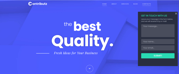
These examples demonstrate the versatility and functionality of pop-ups in various aspects of website design. It’s important to consider your website’s and audience’s specific needs when implementing pop-ups to maximize their effectiveness and enhance user experience.
Benefits of Using Pop-Ups
Pop-ups have become a useful tool to collect leads, decrease page bounce rates, boost conversion rates, and perform many other tasks discussed in previous sections of the article. But what are their advantages compared to static web design elements and banners? The four main benefits of pop-ups make them effective for various functionalities.
One significant benefit of using pop-ups is their ability to grab the attention of website visitors. Unlike other design elements, pop-ups can incorporate eye-catching animations and dynamic features, such as dimming the background, to create a visually engaging experience. With proper tools, you can create unique designs to align with the brand identity and audience’s interests and maximize their visibility.
Another obvious advantage of pop-ups is their precise timing and targeting. They can be strategically set to appear on a website at a specific moment during a user’s journey. Whether presenting a discount code when a visitor is about to leave the site, offering a newsletter subscription form after familiarizing with the page content, or displaying related products, timing is essential for increasing pop-ups’ effectiveness.
By their nature, pop-ups are designed to be compact and focused, delivering information or a call to action succinctly. By absorbing concise and clear communication, users can quickly grasp the main point without getting overwhelmed by excessive content and unnecessary details.
Finally, pop-ups are easy to implement into a website, making them a practical choice for web designers and developers. I could effortlessly create and customize various types of pop-ups with the JetPopup plugin, as it integrates perfectly with Elementor and native WordPress builder. What’s even more convenient is that I can easily manage the settings and visibility conditions of all pop-ups from a single page.

Cons of Pop-Ups
The disadvantages commonly associated with pop-ups include the following:
- Pop-ups can be perceived as intrusive, disrupting the user’s browsing experience.
- By diverting the user’s attention from the website’s main content, pop-ups may cause annoyance.
- Poorly designed pop-ups and their excessive use can lead to negative perceptions of the website and increased bounce rates.
- Some pop-ups may not be displayed properly or function effectively on mobile devices.
How to Create User-Friendly Pop-Ups
It is important to note that disadvantages commonly associated with pop-ups primarily pertain to marketing-related pop-ups. While some argue that you cannot do much about these weaknesses and use pop-ups as they are, I respectfully disagree. I firmly believe that implementing best practices and making pop-ups more user-friendly can address every drawback effectively.
Basic user-friendly pop-up principles
Before overviewing more specific and actionable recommendations for enhancing pop-ups’ performance, effectiveness, and overall impact, it’s worth defining basic user-friendly principles. Unsurprisingly, these fundamental guidelines address the disadvantages in this article’s previous section.
- Ensure that pop-ups are not overly intrusive or disruptive to the user experience.
- Craft clear and compelling messages within the pop-up that succinctly convey the intended action or value proposition.
- Optimize pop-ups for mobile devices to ensure they display properly and offer a seamless experience across different screen sizes.
- Display pop-ups at strategic moments that align with the context of the current web page.
Best practices for using pop-ups
With a thoughtful website pop-up design and consideration for user preferences, it is possible to balance achieving marketing goals and ensuring a positive browsing experience for website users. Here are practical recommendations for implementing user-friendly pop-ups:
- Use clear, engaging headlines.
Your headlines should clearly communicate the value or benefits users will receive by engaging with the pop-up. Don’t underestimate the power of attention-grabbing words like “Free,” “Sale,” and “Discount.”
- Choose the appropriate pop-up form.
Employ a mix of pop-up forms to optimize their engagement and performance. Remember that some formats act more aggressively than others. For example, fullscreen pop-ups are OK for age confirmation, technical requirements, or other questions requiring user agreement, but they are the most intrusive when used for marketing goals.
- Set the pop-up timing.
Display pop-ups at the right moment to maximize their impact. As a general rule, don’t use entry pop-ups. Instead, set their appearance for 10-20 seconds before the average user leaves your website.
- Match your website design.
To make the pop-up feel like a natural extension of your site, employ your brand’s colors, typography, tone of voice, and layouts. Otherwise, it will look like an intrusive ad.
- Create contextual pop-ups.
You must align the pop-up’s content with the users’ interests, needs, behavior on the website, and the specific context in which the pop-ups will appear. Contextual pop-ups don’t seem irrelevant, so use different pop-ups for different web pages.
- Lower the number of input fields.
Whenever it’s possible, use no more than two input fields. Website visitors are more likely to tolerate being interrupted for one or two questions than three or more. If you want to employ a website survey pop-up or a multi-question review pop-up, start by asking if visitors agree to fill it in a separate pop-up.
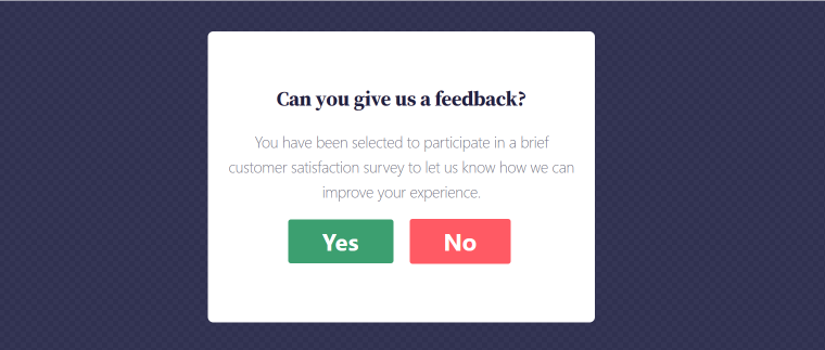
- Don’t overuse pop-ups.
Don’t let different pop-ups bombard your visitors instantaneously. Use timing settings to create a complementary sequence and reasonable frequency gaps between them.
- Provide easy exit options.
Allows users to close or dismiss the pop-up easily by clicking a prominent close button and overlay.
- Use responsive designs.
Ensure that pop-ups are mobile-friendly. Test the display and functionality on various devices. Remember, the percentage of mobile users grows every year, and so does the effectiveness of mobile pop-ups
- Use images.
If possible, include an image to make a simple pop-up more informative and entertaining. Remember that original visuals make your brand more authentic and add trustworthiness.
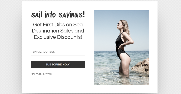
- Use a friendly tone and humor.
As with creating other design elements, using a friendly tone and injecting humor creates a positive and approachable brand image. A lighthearted tone can help alleviate any potential dissatisfaction the visitors may have with pop-ups.
Conclusions
Pop-ups effectively achieve various goals, such as capturing leads, increasing conversions, and improving site navigation. However, their effectiveness is often accompanied by the perception of intrusiveness, as they can interrupt the browsing experience and distract from the main content.
When considering the annoyance factor of pop-ups, it’s crucial to prioritize user experience and implement strategies that minimize disruption. Website owners can mitigate user frustration by adhering to best practices, including carefully timing the appearance of pop-ups, ensuring they are easy to dismiss, and avoiding excessive frequency. Special tools and plugins designed for creating pop-ups make the process easy and efficient without extensive technical knowledge or resources. JetPopup is a WordPress plugin with multiple customization options allowing the building and easy editing of a wide range of pop-ups from scratch or using an excessive library of prebuilt templates.
