Plugins play an important role in creating WordPress websites. The two massively popular page builders are Divi and Elementor. Both are recognized as superb solutions for producing custom content designs and page layouts. While it is true that Divi and Elementor share many similarities and have tools to complete many tasks, there are essential differences between these builders. In fact, knowing about some of the features and pricing differences may lead you to go one way or another.
Before I dive into a detailed comparison of these two plugins, let’s clarify that I am not looking for a “winner” of the pair. Instead, I will present similarities and differences to help you decide which one fulfills your needs.
Elementor vs Divi: What’s in Common?
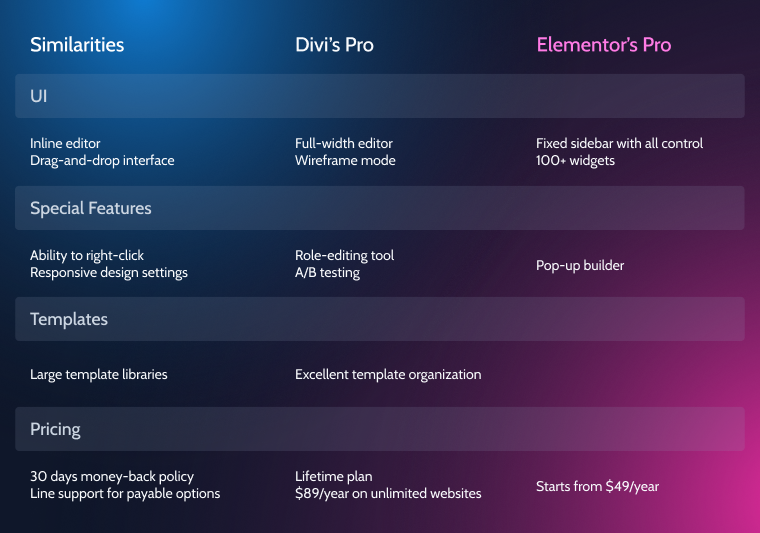
Divi and Elementor builders allow users with zero coding experience to create visually appealing and professional-looking websites. The most obvious similarity that they have is that they use drag-and-drop interfaces. That means you can place elements on your page by dragging them from a sidebar window (Elementor) or a pop-up (Divi) and dropping them wherever you want. The whole process of creating an element, be it a button, heading, or an image, etc., takes only a few clicks. Imagine the amount of back-end coding needed for the same procedure if it wasn’t for this drag-and-drop feature.
There’s one more feature that puts Divi and Elementor at the top of the game. And that is inline editing. This one means you will be able to edit your page while seeing exactly what the visitors will see. There’s no need to switch between the front-end and wireframe look (in fact, Elementor doesn’t offer wireframe mode). With Divi, you edit in a full-width mode with no fixed elements on a page at all times. With Elementor, you still have the sidebar when you edit, but you can press a little arrow on its side and hide it to check out how the page looks in full width.
Some other cool features they have in common:
- ability to use a right-click;
- responsive design settings;
- theme builder functionality.
It’s not a surprise that WordPress premium plugins share many similarities. Whenever the developers come up with a substantial improvement to their product, their competitors attempt to copy it or invent a similar solution. By no means the list of features shared by the two plugins is explicit. But these are all handy tools that make Divi and Elementor the best in the league while most of the other page builders still lack them.
Elementor vs Divi: What’s Different?
Divi and Elementor share some of the core features that excellent page-building tools must have. They are, nevertheless, preferred by different customers, depending on their experience, work style, and budget. So let’s discuss the in-depth differences between Divi and Elementor and analyze their strong and weak sides.
Divi vs. Elementor UI
Divi gives both front-end editing and back-end editing access. In real life, most people use front-end visual editing, so we’ll jump right on it. With Divi’s full-width editor, there are no fixed elements except for a single button on the bottom of the page, which opens up a small menu with access to high-level settings.
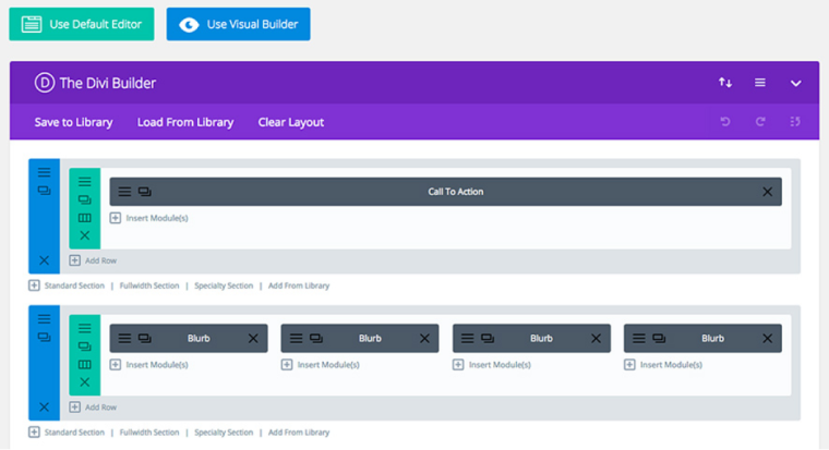
To add elements, you must click on one of the floating buttons that appear as you’re hovering over your design. Divi builder gives three types of elements to work with:
- Section—the largest container;
- Row—rows split space inside of the section. They can be resized and grouped according to Divi’s presets;
- Modules—actual elements, such as images, headings, and text. Divi provides 36 modules.
As you hover over a previously created element, another type of a pop-up will appear, giving access to settings specific to this element. Thanks to the drag-and-drop techniques described above, repositioning all elements and resizing sections is effortless.
Elementor splits the screen in two, having a live preview of a web page on the right and a sidebar on the left. The sidebar is where all the building tools are. For example, the list of widgets (same as modules in Divi) is presented here. Elementor makes use of 90+ widgets (40+ widgets in a free version and another 50+ in Elementor Pro). That is almost three times as many as modules in Divi.
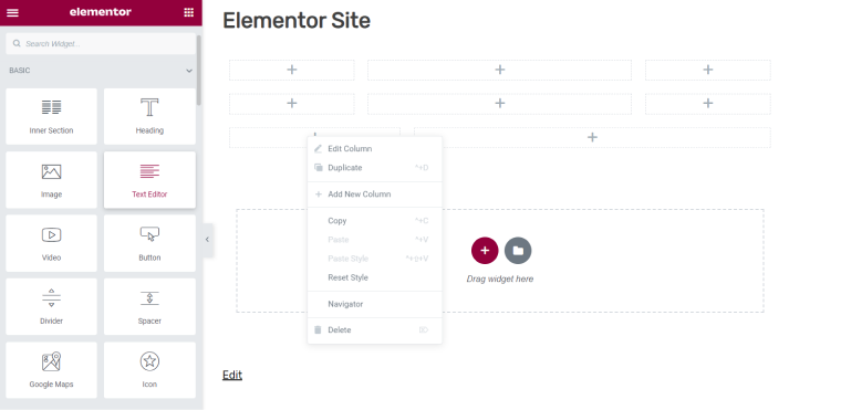
The sidebar is always visible during editing and can only be hidden in preview mode. It doesn’t create a live editing impression like Divi’s builder does, but all the basic commands can be accessed directly from the sidebar with fewer clicks. It is also possible to do some inline editings directly on a preview of the page, like typing text.
It’s fair to say that both builders offer easy-to-use editors. They both structure pages using three categories of elements and allow relative freedom in their editing (you still cannot overlap different elements, something that non-WP editors can do). But the overall impression of using them is distinct. Divi’s minimalistic approach is responsible for a cleaner look for the editor, and I praise the fullscreen experience provided by Divi. But it does take some time to get used to floating buttons and pop-ups. And adding new elements requires a lot of clicking. Elementor, on the other hand, employs a more conventional approach by making most of its tools easily accessible. It is also a plus to have more than 90 widgets available without using third-party add-ons.
Divi vs. Elementor special features
In this section, I’ll present features unique to each builder. Knowing about them could alter your decision about which of the two will do the job better.
Divi builder incorporates A/B tests for pairs of modules to analyze which ones are better for a specific goal. Such a split test helps design landing pages and optimize the content built with Divi. It is definitely a strong argument for Divi in business-oriented cases.
Divi has a role-editing tool. It can lock/unlock certain modules and settings from WordPress users assigned different roles. It’s a helpful tool if you’re making clients’ websites and don’t want them to mess up with your work.
Although Divi is available as a standalone plugin to work with any WordPress theme, it also comes with a default Divi theme, something that Elementor is missing. While this is not important for those who want to work with their favorite themes, some can make use of this high-quality theme built to match the Divi plugin perfectly.
Elementor’s pop-up builder is a big one. This tool, combined with numerous widgets, can create eye-catching promo pop-ups, email opt-in, login/registration, etc., and place them anywhere on the site. It’s more flexible than third-party plugins because it uses the same drag-and-drop builder.
Divi vs. Elementor templates
One of the significant advantages of both builders is that they come with tons of beautiful templates. Instead of starting from scratch, download a template, adjust it to your needs, and voila, there’s a professionally looking website.
Both Divi and Elementor are backed with impressive pre-made template libraries. Divi offers 2000+ templates grouped into 265 layout packs. In Divi’s jargon, “layout packs” are sets of templates, such as a home page template, contacts page, etc., all bundled around one theme. Such template organization speeds up website designing by many hours, if not days.
Elementor primarily offers templates designed to add one page at a time. It only started offering themed packs of templates, or website kits, as they call them, in the last year. There are little over 100 of those.
While Divi clearly offers more options about pre-made templates, it’s worth browsing both builders’ libraries to see which one is more relevant for the type of work you do.
Divi vs. Elementor pricing
Pricing is critical for many customers choosing between Divi and Elementor builders. Elementor is the only one offering a free version. A comparison of Elementor Free vs. Pro (payable version) is worth another whole discussion. For now, it’s worth saying the free version limits the number of widgets and templates offered to customers and some of the premium features and access to all the Pro updates. Still, Elementor Free is a fully functional plugin capable of building some great-looking designs.
Now let’s turn to payable versions of these builders.
Divi’s has only two plans to offer. The Yearly Access plan for $89/year, and the Lifetime Access Plan for $249 (one-time). Both plans let you use Divi on unlimited websites. Another benefit is that the price grants access to all products from Elegant Themes.
Elementor has yearly plans. All the Pro plans include premium features and extras. The prices are:
- $49/year for one website activation,
- $199/year for 25 website activations,
- $399/year for 1000 website activations.
Both builders have 30-day money-back policies for risk-free trials.
All things taken into account, Divi is cheaper if the goal is managing multiple websites. Its Lifetime Access Plan is a great option for businesses. However, Elementor’s $49/year license is hard to beat if we’re talking about page builder for one site.
FAQ
Elementor and Divi are two of the top page builders, each having its strong sides. Customers may prefer one plugin or the other depending on their goals and budget.
In web apps, drag-and-drop refers to picking up and moving elements using a mouse cursor and visualizing this process.
Divi is cheaper if you use it on multiple websites. It is also the only one that offers a lifetime license.
Yes. There are no hidden fees or forced subscriptions.
Full-width page editor, A/B testing, immense templates library, front-end, and back-end modes.
Ability to create elements in one click, pop-up builder, extended list of widgets.
It’s possible because they are both WordPress builders. It may, however, negatively affect the page’s performance and speed.
Divi vs. Elementor: Your Choice
Both are awesome website builders. They employ unique design tools such as drag-and-drop interface and inline editing. When comparing Elementor vs. Divi, there’s no clear winner as it all comes down to personal preferences and budget.
Elementor does seem to be better for beginners—it’s very easy to learn, and the interface with a static sidebar is user-friendly and quick to respond to. Elementor’s free version is fully suitable for creating professionally-looking designs.
Although, Divi’s minimalistic interface looks revolutionary compared to other plugins. It grants a full-width editing experience while having the option to switch to a wireframe look. Its feature options like A/B testing, Role Editor, and better pricing on multiple activations can be preferable for business customers.
Please, Croco team… do your best to get Crocoblock working in Divi. Our only alternative similar to your package is DiviEngine and it fails badly. They don’t bother to solve problems, the assistance is terrible, and the prices are outrageously high for much less than what you offer.