Have you ever bought anything on the Internet? Or have you signed up for something? One of the main reasons you clicked on a button and ordered a product or subscribed to a newsletter was a compelling call to action.
While it’s essential to write eye-catching headlines and hooky subheads that entice an audience to read on, it takes more than the usual attention to create an irresistible call to action.
Every successful marketer will agree that convincing a reader to take a specific action is the most critical capability required in your content to improve conversions or drive audiences further down the marketing funnel.
And it is not surprising. You tell the person what actions you expect from them and what exactly you offer. Their task is to accept or reject your offer. If it’s vague, unsure, or has nothing to do with what you’re talking about in the rest of the text, the call to action likely won’t work.
You want the readers of your marketing content to take the next step once they have finished reading. A compelling call to action (CTA) acts as a bridge between your audience and conversion. It should be the final nudge that makes a reader take a step closer to becoming a customer or viable prospect. In this post, I will share some real-life examples of solid CTAs that work.
Table of Contents
- 5 Key Rules for Building the Best Call to Action
- Use powerful words
- Great CTA examples
- The Biggest Mistake You Can Make When Creating a CTA
- FAQ
- Conclusion
5 Key Rules for Building the Best Call to Action
Now I will share some tips to make your copywriting strong and your CTAs effective.
- Know your purpose. What exactly do you want from a potential client? Do you want the audience to visit a particular landing page? Buy a product? Download a book? You should tell the person clearly what you want them to do.
- One text, one action. This rule works for both landing pages and social networks. Do not offer to do several things at the same time. For example, first, you offer to download a coupon, buy a new refrigerator, and then come to the concert. The more offers, the more you confuse the person, and they do not understand what exactly they are required to do.
- Study the desires of your customers. You must complete this step before creating any text. For example, if your client is not interested in repair, no matter how you offer them the design of the apartment, they will not order it. Learn more about creating well-defined buyer personas.
- There are no magic words. You can find dozens of examples of calls to action on the Internet. In this article, I will also show some of them. But they do not have magical properties. Instead, these are powerful words that have been applied in the right place. For example, if the CTA sounds like “Buy,” then before, there was a description of what to buy and why.
- The CTA should grab attention. In addition to strong words, it is essential to use highlights, different colors, and different design elements so that a potential client can see where to click and your call to action stands out the most on the page.
So, are you ready for some examples of strong calls to action?
Types of CTAs
The five most common types of CTAs you can use to effectively drive conversion in your marketing include:
Lead generation. Use this type of CTA to collect leads from your website or landing page. If you are using this on an eCommerce site, including a membership option so visitors can join the site before they purchase.
Form submission. With this CTA, drive traffic to a form where contact details, including name and email address, can be provided by your reader so that you can add these to your marketing database. Offer a free download or access to gated content in exchange.
Read more button. You’re inviting website visitors to learn more about your product or service — direct traffic to a dedicated landing page.
Product or service discovery. This CTA previews your product or service and should link to a detailed, dedicated landing page. Use language that inspires readers to discover what they seek by leveraging your insights after segmenting your audience into personas.
Event promotion. These CTAs also leverage your audience segmentation and persona development and drive interest in upcoming events that interest a targeted persona. Offer early bird tickets or a countdown to the event to increase FOMO anxiety in your readers.
You can make a call to action in the form of a button, link, pop-up, or banner. All of them will work if you use strong words and speak the same language as the audience.
Use Powerful Words
One of the components of a good CTA is the use of strong words. It’s all about psychology. Surprisingly, people love to be told what to do. It helps to relax and think less. If you create a CTA that makes sense of urgency or exclusivity, you will hit the mark – such calls to action work better. Of course, if your product is what customers need and your CTA is visible on the page.
Some of the best power words for CTA are:
- Now;
- While stocks last;
- Don’t miss out;
- Must end;
- Hurry;
- Offer ends;
- Limited edition;
- Exclusive;
- One-off;
- Biggest ever;
- Get lifetime access;
- Get started for free;
- Only today;
- Download;
- Special offer;
- Try 30 days free;
- Register;
- Join us;
- Upgrade.
Another important point to keep in mind, there isn’t a specific word limit for CTAs. However, you have to remember that the longer your CTA is, the more likely the effect will be diluted.
Try to sum up your message in as few words as possible.
Great CTA Examples
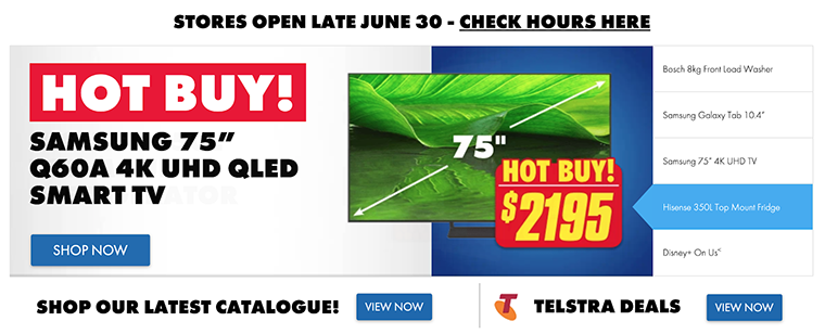
Shop now
There’s nothing better than getting to the point, and this simple CTA does that.
No beating around the bush entices visitors to shop and is ideally suited to cohesively bringing together the company’s overall branding with the special promotion on a landing page environment.
Additionally, you must ensure that the graphics and fonts used are all exciting and that they match your brand’s messaging.
Learn more
This is probably the most common CTA found on a website. It’s great if your product or service needs a little more explanation, and you can link your CTA to a dedicated landing page like a product page or product tour.
The rule to remember is that this CTA is a low-commitment one and does not imply that visitors are interested in buying your product or service. They want more information about how it works because they are researching or simply curious.

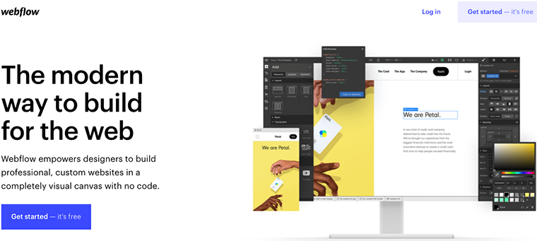
Get started
In the software-as-a-service (SaaS) space, this is probably the most popular CTA, and for a good reason. It’s highly actionable and suggests that your visitor are ready to begin moving forward down the buyer’s journey to the purchase stage. The aim is to get them to use your product/service by clicking on the CTA button, and hopefully, they will wonder how they ever lived without it.
Try this one if you don’t know which CTA is good to start with. Also, add “it’s free” to the end of the CTA to dispel any price objections that may arise in a reader’s mind.
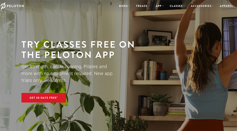
Get 30 days free
What’s better than a free offer?
Getting 30 days free. This is a great CTA to use for any membership plan that requires a long-term commitment to see results, like getting fit. In the example, Peloton uses the “Get 30 days free” CTA to attract and convert visitors who want to get well. Thirty days is more than enough time for a person to tell whether Peloton’s program is working for them or not.
Here’s another tip, add “for a limited time” to the end of this CTA to add a sense of urgency.
Subscribe
This is a good CTA to get people to sign up for email lists, newsletters, or a blog, as long as you provide compelling reasons why readers should subscribe. The example is a hidden banner that slides in from the bottom of the page and allows the user to read the blog post.
A great CTA like this opens up engagement between visitors and your brand, offering a way for visitors to continue staying in the loop on new developments.

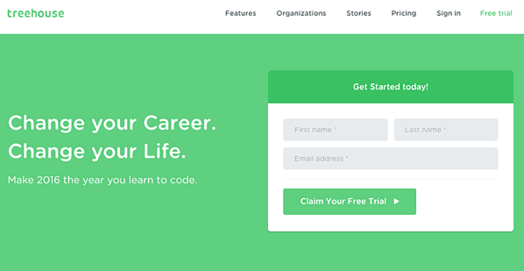
Claim your free trial
There are many company websites out there offering visitors the opportunity to start a free trial. But the CTA in the example goes further; it says, “Claim your free trial.” Using the word “claim” creates just that hint of urgency that is enough to get most visitors thinking, and then FOMO kicks in. You are sure to see a lot more conversions when you do that.
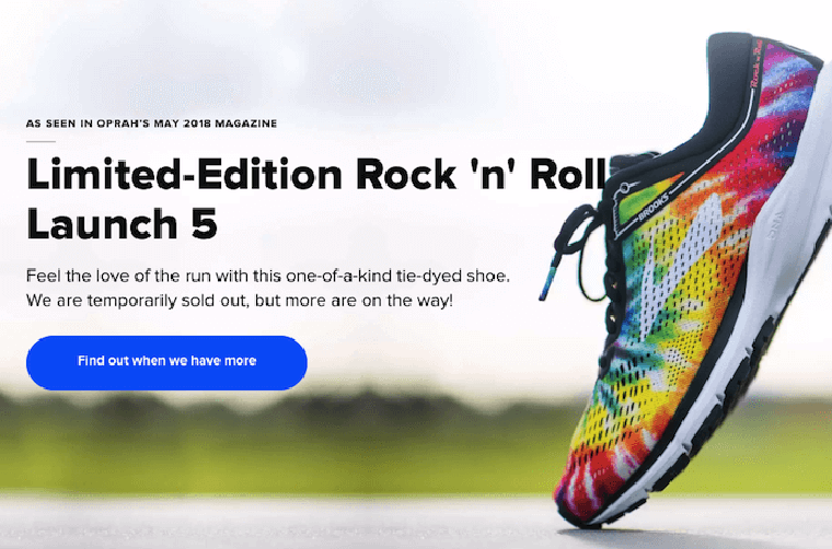
Find out when we have more
Just because you run out of a popular product doesn’t mean you have to stop promoting it on your eCommerce site. All the more reason to ensure that your customers don’t bounce from your website just because the product they are searching for is not in stock.
This CTA turns bad news into an opportunity to retain customers and reframes the conversation into one that increases engagement with your brand.
Without a compelling CTA like this, you stand to lose more than just customers but your hard-earned brand equity in the market as well. This CTA will ensure that your brand remains top of mind until stocks are replenished.
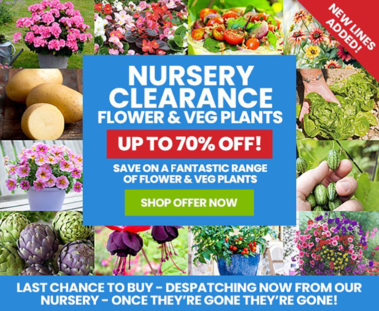
Get X% off
When marketing your promotions online, create a discount offer that gives people a certain percentage off their first purchase when they subscribe to your email list or complete some other action.
CTAs like this, with numbers attached, are pretty appealing. And promotional offers for first-time shoppers are a great way to incentivize them to buy.
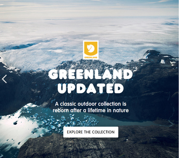
Explore / Discover
If you are driving to a product page that provides a deeper dive and gives visitors more information about your products and services, then you need more persuasive language than just “read more.”
After all, you are asking them to do more work, so your choice of words will be critical to success. Be a little more subtle, and fire up their imagination with these inspiring word choices to encourage them to do whatever it takes to stay in the loop. This CTA will get results.
What we do
Challenge your visitors to learn what your company does before asking them to take any further action. This CTA is down-to-earth and clever because it jump-starts brand loyalty. Even without an action verb, it still manages to entice people to click.

The Biggest Mistake You Can Make When Creating a CTA
I told you what works and what determines the success of your CTA. And now, I suggest considering the mistakes you can make when creating it.
The main mistake is not to add CTA. Your product or program can be unique and wonderful; you can go on and on about its benefits. But people will never guess they need to buy it if you don’t tell them to.
You can use different words, shapes, and fonts. Use A/B testing to find the best-performing word combination. But if you write “Buy Now” or “Download,” you are already on your way to success.
FAQ
When creating a call to action, the main rule is to clearly state what needs to be done. So, if you sell something, the best CTA would be “Buy it now.” If you offer to register, “Register” or “Join us.”
To do this, keep your goal in mind, speak your customers’ language, and tell them what to do. Also, add a selling description of your product or service and highlight the call to action with a color or font.
If you already have a CTA in place, you can create a few more variations using the tips in the article and test with A/B testing what works best.
Conclusion
Now that I’ve covered the best CTA examples to use, it’s time to get them in your content so you can convert more of your audience into leads and customers. Keep in mind that the better you know your audience, the more specific you can be with the actions you want visitors to take. Use powerful words, create a sense of urgency, and above all, support the CTA with clear reasons why visitors need to take the action you want them to.
