How to Setup Mega Menu for Mobile View
This detailed tutorial will teach you how to create a responsive mobile mega menu with the help of the JetMenu plugin.
JetMenu is a plugin to organize the website in the most useful and convenient way. Maybe, you have already heard about it and know the main steps to create a mega menu in Elementor.
Here is a summary of the needed actions:
- Download and Install JetMenu to WordPress.
- Go to Appearance > Menus and fill in the necessary fields.
- Set up Display Location and Enable JetMenu for this Location.
- Choose which Categories, Posts, Pages, etc., you want to display in the Menu.
- Go to JetMenu Options, adjust all settings, and Edit with Elementor.
However, for any website owner, it is essential to make the menu available on any device. The great thing is that you can create a separate menu for desktop and mobile.
In this tutorial, we will show how to optimize the mega menu for mobile devices.
Mobile Menu Settings
There are two ways to make the mega menu mobile-responsive:
- In the WordPress Dashboard.
- In Elementor.
Let’s figure out the first variant.
WordPress JetMenu Settings
To style up the mobile mega menu, go to Crocoblock > JetPlugins Settings > JetMenu > Mobile Menu. Here you’ll see different sections to style up the mobile menu according to your preferences. Let’s have a closer look at them.
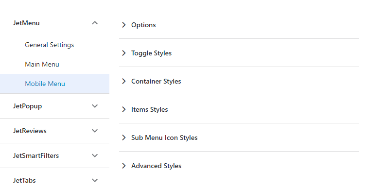
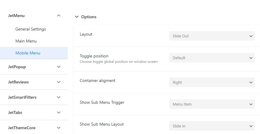
The first section is the Options section. Here you can select the layout, toggle, and container position, show the submenu trigger, and layout.
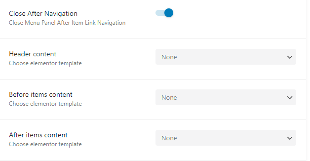
You can enable the Close After Navigation option to close the menu panel after item link navigation. Also, you can choose the Elementor template for the Header content, Before items content, and After items content.
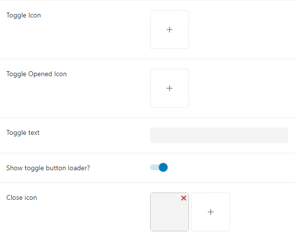
What is more, you can upload a custom Toggle Icon, Toggle Opened Icon, Toggle text, show toggle button loader and choose an icon for it, too.
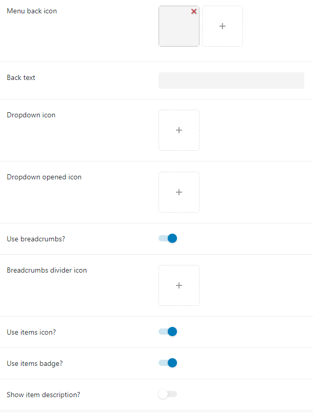
You can also add Menu back icon, Back text, Dropdown icon, and Dropdown opened icon. What is more, you can enable Breadcrumbs, choose a divider icon for it, use the items icon, items badge, and show item description.
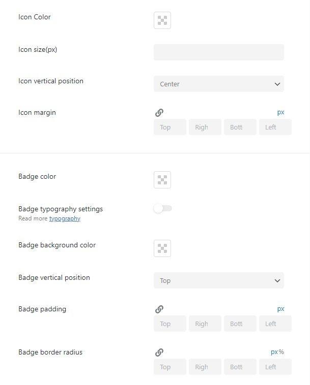
The next section is Toggle Styles. In this section, you can choose Icon color, Size, Background color, enable/disable Toggle border settings, and Box shadow settings. Also, you can set padding and border radius.
Let’s move on to the Container Styles section. There’s an opportunity to add the “Close” button color and Icon, choose the Breadcrumbs text color, Divider color, and Icon size.
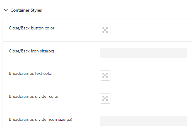
If you enable Breadcrumbs text typography settings, you’ll be able to change such settings as font family, font size, font spacing, etc.

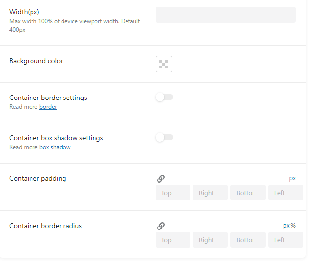
You can also set the Width for the mobile menu, set the Background color, customize Container border settings, and box shadow. At last, you can set Container padding and border radius.
Item Styles section. Here you can choose different style settings for menu items in the Normal and Active states. Let’s have a closer look at them.
In this section, you can choose Label Color, change Item label typography settings, and enable the Items divider option.

Also, you can style up Icon and Badge.

Sub Menu Icon Styles. In this section, you can choose the Dropdown color and Dropdown size for the Sub Menu Icon.
The last section is Advanced Styles. In this section, you can choose the Loader color and Cover background color for your menu.

Mega Menu Mobile Responsive Settings in Elementor
As mentioned previously, it is possible to set the mobile mega menu in Elementor as well.
Go to Crocoblock > Library > Header > Edit with Elementor, press “Edit Mega Menu,” and then go to the General section, where you’ll be able to select the Menu for Desktop and Menu for Mobile. It is incredible because you can create two different menus and style them up as you like.
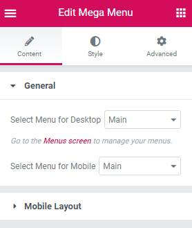
Now let’s proceed to the Mobile Layout section. These section settings are similar to the settings in the JetMenu Settings in the Dashboard. Still, if you want to see what you’re changing and what the menu looks like, it will be better to customize the menu in the Elementor editor.

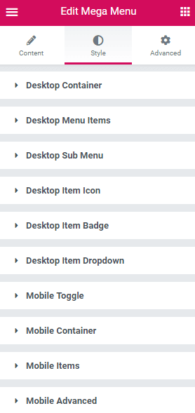
In the Style section, you can select different settings for the desktop and mobile. As you can see, the style settings for the mobile are the same as in the Dashboard.
Revamp Mobile Menu
In case you don’t want to create two different menus, one for desktop and one for mobile, and simply want to use one menu on different devices, you can use the Revamp Menu option. You can find it in Crocoblock > JetPlugins > JetMenu > General Settings. Once this option is enabled, you start building menus from scratch. To get back to the old menu, switch this toggle off.

After that, open your Header in Elementor and add the Mega Menu widget. We can see that now the Mobile Device Render option appears in the Layout section. Once we enable it, we can customize the same menu we have for the desktop. Without this option enabled, the menu will be simply responsive. That means that your Mega Menu would be converted to a Mobile one due to the Breakpoints you set. But with the Mobile Device Render, we can set up the menu for different devices manually according to our needs.

The Mobile Menu section is the same as we had before we enabled the Revamp Menu option.

To check how the menu will look on mobile devices, just scroll down. You will spot the Responsive Mode Option; click on it and choose the mobile preview.
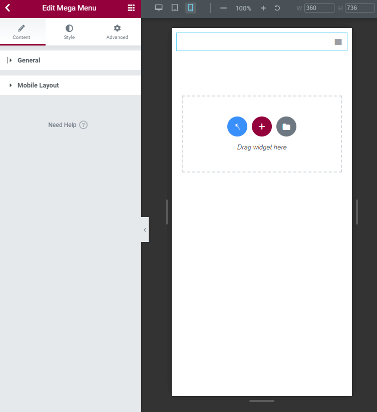
Preview Result
It is crucial not to forget to press the “Save/Update” button. Otherwise, the changes will not be saved and displayed.
Well, we are sure you want to look at it in action. So, let’s check how the menu will look on mobile:
Now you know how to create a fabulous mobile menu for your website with the help of the JetMenu plugin.