Crocoblock Style Guide
Follow these guidelines and learn the right way to use the Crocoblock logos, ad
creatives, and brand assets.
Crocoblock Logos
Primary logo
This is our primary logo – note the horizontal orientation. Do not attempt to recreate or move logo elements.
Clear space. To maximize visibility and impact, ensure the logo has enough clear space to breathe.
Minimum size. The primary logo should be at least 116 px wide or 16 px high.
Secondary logo
When the primary logo doesn’t fit your composition, use the vertical orientation.
Clear space. Our logo should always have space to breathe. To maintain consistency, it is recommended not to place other elements around the logo.
Minimum size. This logo should be at least 72 px wide or 36 px high.
Logos and backgrounds
We have two logo variations – colored and monochrome. Colored logos can be used on contrasting light and dark backgrounds.
Monochrome logos are best to use on rich backgrounds but pay attention to readability.
Format: PNG, SVG
Download logosCrocoblock icon
The Crocoblock icon can be used in the menus, list items, and footers. Make sure to leave enough space around the icon and choose a flattering background color. The icon looks its best in a small size.
JetPlugins Logos
Primary logo
We have 20 plugin logos, each with its own name and corresponding color. Depending on the plugin name, there are one-line and two-line logos. We recommend you use a primary logo for product recognition.
Clear space. It should be provided around the logo. To maintain consistency, it is advised not to place other elements within the clear space.
Minimum size. The minimum height for a one-line logo is 40 pixels, and 60 pixels for a two-line logo.
Secondary logo
If the primary logo turns out unfit for style reasons, you can use secondary logos. Please do not change the plugin colors and their shape/rounding, as it affects the recognizability.
Clear space. To maximize visibility and impact, ensure our logo has enough clear space to breathe.
Minimum size. The secondary logo should be 80 x 80 pixels.
JetPlugins primary logos for light themes
If you use the plugin logo on a colored background, please make sure the logo does not blend in with the background.
Secondary JetPlugins logos
There is only one version of secondary logos used for light and dark themes without alterations.
JetPlugins icons
JetPlugins icons can be used in the menus, list items, and footers. Make sure to leave enough space around each icon and choose a flattering background color. The minimum size is 48 x 48 pixels.
Banner Ads
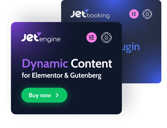
We have created and packed additional materials for you, which you can use to create advertising content about Crocoblock. Download top-performing ad sizes for the most popular JetPlugins.
JetPlugins: JetEngine, JetAppointment, JetMenu, JetBooking, JetSmartFilters, JetWooBuilder, JetElements
Format: JPG
Folder size: 25,7 МB

Brand Assets
Colors
Primary colors
Shamrock, Royalblue, and Orchid are primary colors in the Crocoblock identity system. It is preferable to use these colors when a project requires a bunch of signature colors.
Secondary colors
The secondary colors give vibrancy and variety to the brand. We have the unique opportunity to express our brand through a wide range of colors spanning the whole spectrum.
Neutral colors
Neutral colors are used for texts: black is for headings and background, white is for the background, and grey is for text content.
Typography
Cabin for titles and headlines
Bold is the primary typeface for Crocoblock. Use it at large sizes for any display copy, headline, and pull quotes.
Download fontabcdefghijklmnopqrstuvwxyz
1234567890(,.;:?!$&*)
Roboto for plain texts and paragraphs
Sans serif typeface is used in smaller contexts, in the user interface, and as a functional support to the primary serif.
Download fontabcdefghijklmnopqrstuvwxyz
1234567890(,.;:?!$&*)