Do you need to show a lot of statistics?
Everybody knows that it’s easier for a person to perceive visual information. So, instead of overloading your text with digits, we suggest you display it using charts and bars. It is suitable for both you and the user. You can quickly and beautifully show relevant data, and the reader can view it conveniently. In addition, you can put special marks on the graphs so that they are displayed when clicked and give more information.
Crocoblock has a JetElements plugin with Progress Bar, Circle Progress, Pie/Doughnut Chart, Bar Chart widgets, and JetEngine Dynamic Charts Builder module for creating charts and graphs quickly. Let’s have a closer look at each of them.
Table of Contents
- What’s the Difference Between Static and Dynamic Charts?
- Create Static Charts
- Create Dynamic Charts
- FAQ
- Sum Up
What’s the Difference Between Static and Dynamic Charts?
It would be best to have static charts when there are no edits in its data – for instance, reports or documentation.
At the same time, dynamic charts’ naming calls for themselves 😅. Dynamic charts are used to display changing external data. For example, website user data (sorted by gender or age), geographical charts, etc.
The main difference between dynamic and static charts is the ability to refresh data automatically. For instance, you have a geographical chart, and you want to add new countries or delete some.
So, you don’t need to refresh or build a new chart. Otherwise, add the latest country to the custom post type, and the chart will be automatically updated. This is the power of dynamic content. 💪
Create Static Charts
Let’s start with static charts you can build with JetElements widgets:
- Progress Bar widget for Elementor
- Bar Chart widget for Elementor
- Circle Progress widget for Elementor
- Pie/Doughnut Chart widget for Elementor
Progress Bar widget for Elementor
The first way to showcase important data is to use the Progress Bar widget. This widget suits great for showing any kind of progress. For instance, you can easily tell your site visitors about your achievements, deliver the results in percent or any other kind of value, and present it in the most appealing way.
Let’s imagine you are responsible for the government website, an educational page in particular. A new program attracting foreign volunteers with a knowledge of English has been implemented. Native speakers already work in 64% of the country’s educational institutions.
You have to display the results on your website. With the options included in this widget, you will be able to design the bars that perfectly match your whole interface.

There are different types of progress bars that you can choose from. They differ from each other by the position of the Title, the Icon, and the Percentage, which can be either inside, above, or on the right of the bar itself.
Moreover, the bar is animated, which means once you open the page, the status bar moves from left to right.
Bar Chart widget for Elementor
There is no need to create several sections with the Progress Bar widget to show the difference since the Bar Chart widget provides you with such an opportunity on the spot.
The widget aims to showcase discrete data points or categories, mainly when large numbers are used. Bar Chart is a great solution when you need to show the results comparatively.
Let’s imagine you have to compare pasta production in tons in different countries.
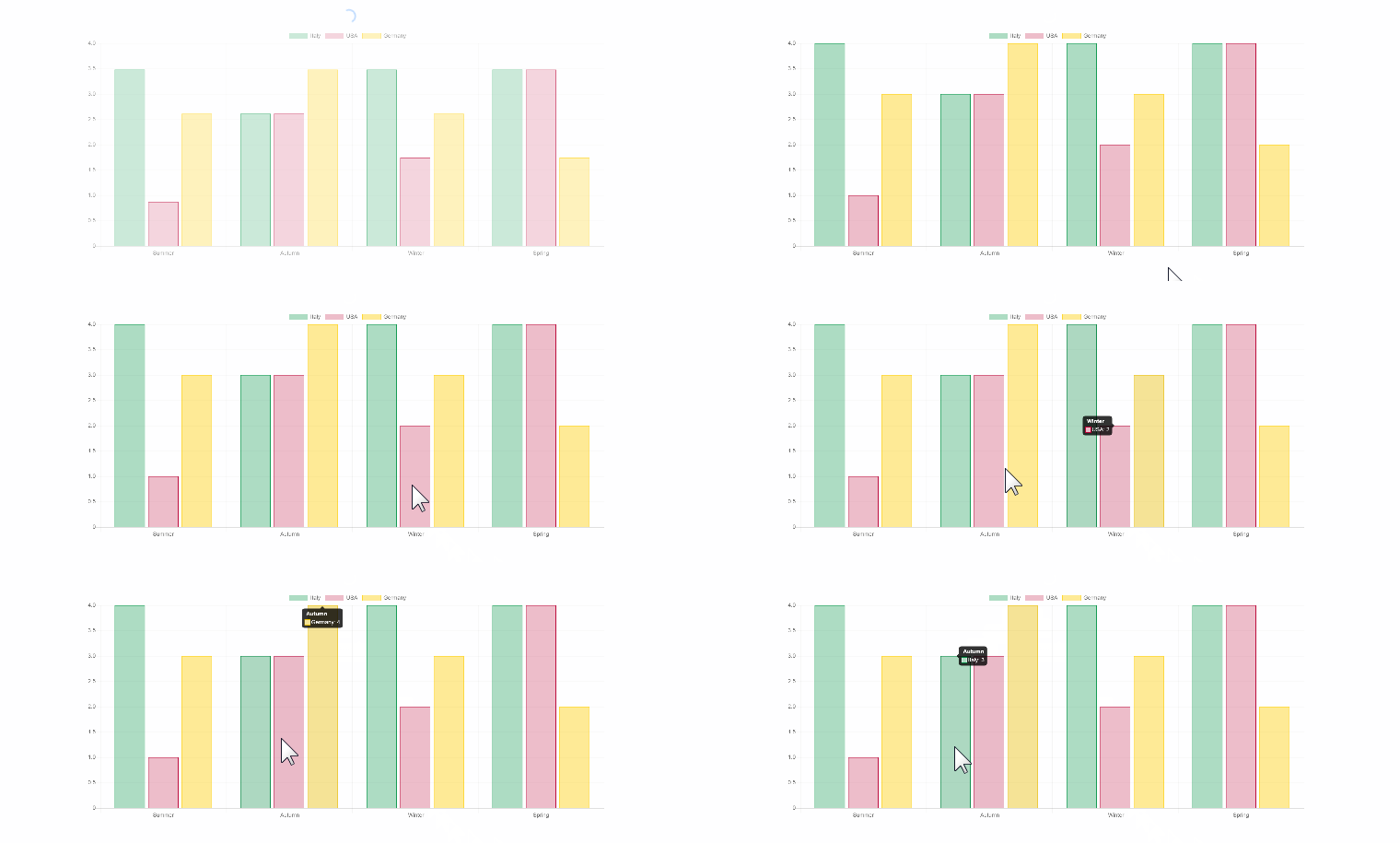
The Bar Chart widget is really flexible and comes with versatile settings controls, allowing us to play around with the chart’s layout and find the best one to satisfy the user’s needs. At the same time, it’s quite easy to adjust the settings and select whether the chart should be vertical or horizontal, whether the grid lines should be shown or hidden, etc.
Circle Progress widget for Elementor
Circle Progress widget allows you to display not only percent but also absolute values. Why is it so unique? Single circle progress is made up of tiny details, and the good thing is that you can style up and adjust each of them.
If you need to show how much progress is achieved and how much is left, the Circle Progress widget is a good choice. It clearly shows whether the result was fully achieved.
If you want to display the number of people from 20 to 30 years old who use different social networks, you can use this widget.
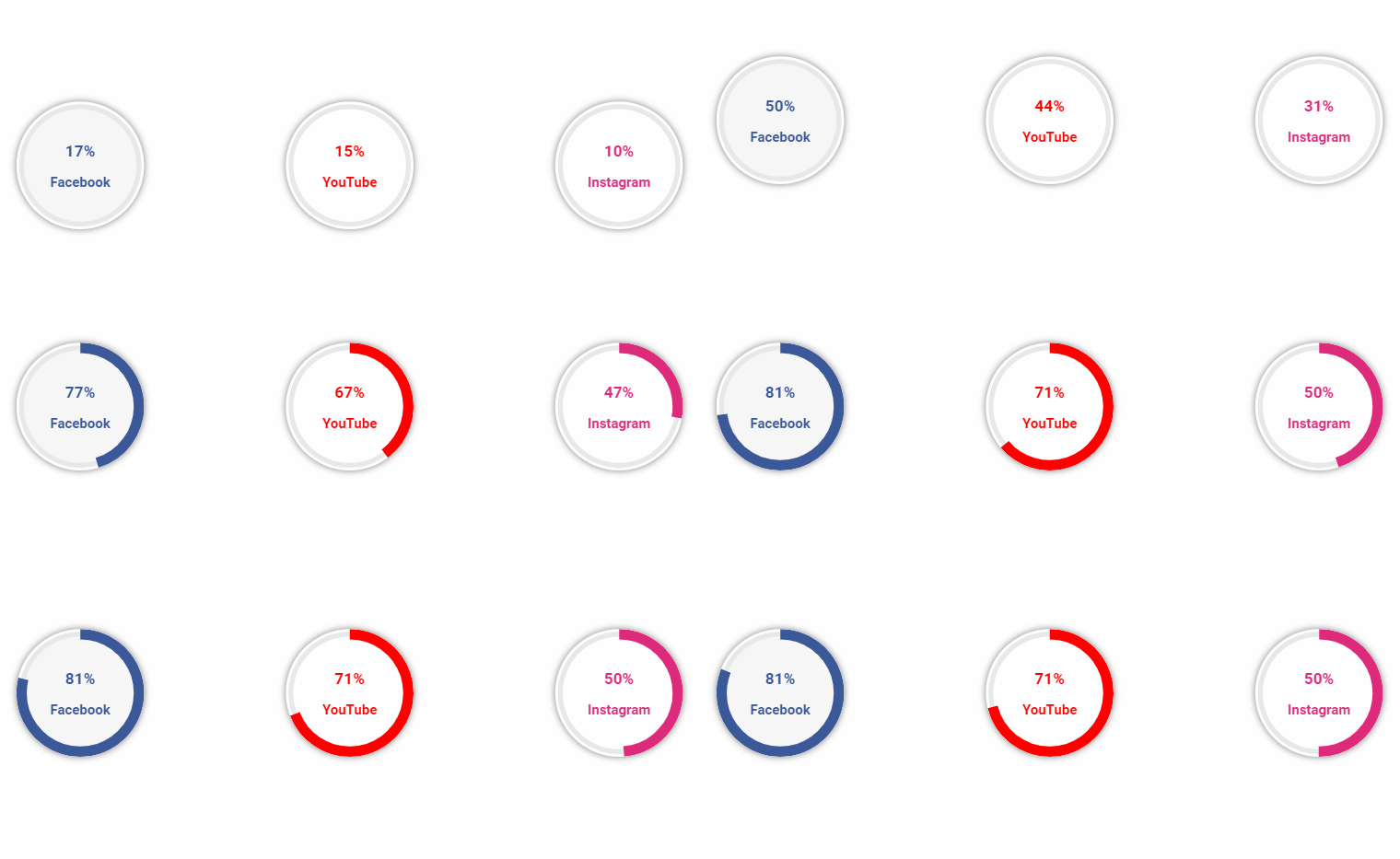
The Circle Progress widget is a handy tool because it comes with several settings controls, which allow you to adjust it quickly and make it visually attractive. It’s an easy way to display information and, at the same time, make your website engaging.
It is also helpful if you want to show the progress of a task or fill in the field.
Pie/Doughnut Chart widget for Elementor
Displaying the statistics is as easy as pie with a Pie Chart widget. Here you can make each section a different color and display the information either above, below the chart, or even on hover.
The Pie Chart widget is the easiest way to show the parts of a whole and let your visitors obtain information as a holistic view while being visually understandable.
The Cutout Percentage option allows you to turn a pie chart into a doughnut (we wish everything were this easy in real life)!
The Pie Chart widget can be one of the most eye-catching elements on your site, with its nice layout and versatile settings. You can enrich it with tooltips, set the height and animation duration, select the best-fitting colors, etc.
The result will impress you, and the widget can become a cherry on the pie on your website!
How to create a static chart?
Creating a static chart is very easy. You need the following:
1. Go to your site’s Dashboard.
2. Make sure you have the JetElements plugin installed and activated.
3. Add a new page or post.
4. Select the type of chart or graph.
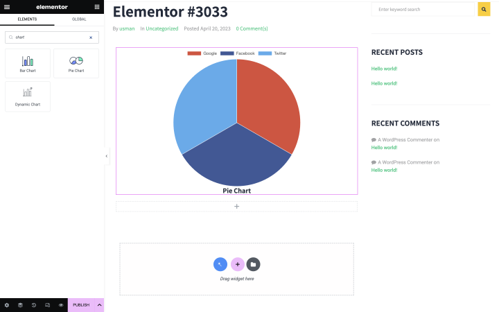
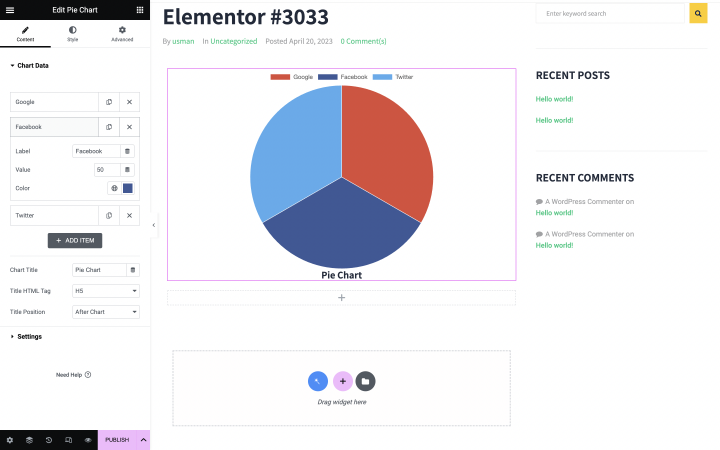
5. Specify the correct data, select the color, size, and other parameters of the chart.
Create Dynamic Charts
With the recent JetEngine update, you can build dynamic charts in Elementor and Gutenberg editor.
Dynamic Charts is a built-in JetEngine module. You can download and install it when you need it.
📚Read also our Charts Builder overview.
What dynamic chart types can you build?
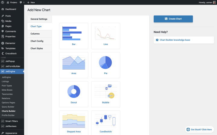
After installing the Charts Builder module, you can enjoy 12 charts and graphs types:
- Bar
- Line
- Area
- Pie
- Donut
- Bubble
- Stepped Area
- Candlestick
- Histogram
- Columns
- Scatter
- Geo
How to create a dynamic chart?
There are a few steps to follow in creating a dynamic chart.
Step 1: Enable the Dynamic Charts Builder module in JetEngine external modules.
Step 2: Create the Query.
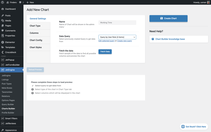
Step 3: Set general settings: name, select Query.
Step 4: Choose the chart type.
Step 5: Add new columns.
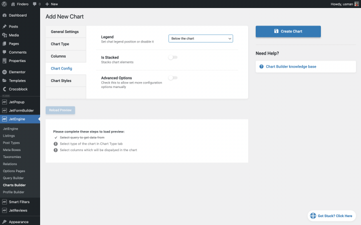
Step 6: Configure your chart: set the legend or advanced options.
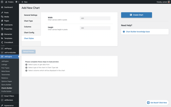
Step 7: Style the chart or graph.
Step 8: Add the dynamic chart to Elementor or WordPress editor.
FAQ
Add a chart or graph with additional WordPress plugins. For example, you can use JetEngine or JetElements to create dynamic and static graphs or charts. Choose the type of chart or graph you need, upload the data, choose a style, and look at the result.
Dynamic charts and graphs data change in real-time and are immediately displayed on the website. Static charts and graphs data remain the same as you set them when creating the site.
You can do this in several ways. For example, take a screenshot and add a picture. But such a schedule will look unprofessional. In addition, if the data changes, you will have to build a new graph and add it to the site.
You can also upload data from Excel to your website when creating a chart. Next, set the data display’s style, size, and form and add them to the page. This method allows you to change the data quickly and the graph’s appearance, if necessary.
Sum Up
Charts and graphs are one of the most valuable options for showing users a lot of data. They are vital if the site needs to display changeable numbers or extensive data.
Fortunately, there are ready-made tools to create them. You must add information, choose a style and hints, and look at the result.
You can add dynamic and static graphics to your website or keep one. It depends on how much information you want to add.
Choose the one you like best and start creating!


Se pueden hacer gráficos de Gantt con esta herramienta ¿cómo?
Desafortunadamente, el diagrama de Gantt no se encuentra entre los tipos de gráficos, pero puede utilizar una de las variantes de gráficos sugeridas. Este tutorial le ayudará a entender cómo crear su propio gráfico en WordPress utilizando Dynamic Charts Builder: https://crocoblock.com/knowledge-base/features/jetengine-dynamic-charts-builder-overview/.